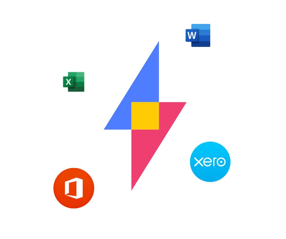
Today we’re launching our new brand. Over time, it’s become clear that our current brand no longer shows the world who we are and who we want to be, so we’ve made some changes! While we’re incredibly proud of this new look, we’re increasingly focused on what these changes represent for our product and our customers going forward. In this blog we’ll take you through the changes to our brand, how they underpin upcoming changes to our product, and what they mean for you, our (epic) customers!
What’s Changed
SuiteFiles has a new logo, new colours, and a new font! Our cloud logo has been replaced by a lightning bolt, made up of geometric shapes. This change represents our focus for SuiteFiles moving forward. The lighting reflects our goal to make the product fast, efficient and dynamic, while the square in the middle (where the two parts connect) highlights our continued focus on making it easy for people to share and collaborate, both with their teams and their clients. We’ve also changed the dots above the I’s in SuiteFiles, which represent you, our customers, who we put at the forefront of everything we do.
Our new font is cleaner and hopefully easier to use, and you’ll notice the introduction of pink and yellow into the brand. These colours are vibrant and bold, which aligns in our brand values. You can see them all in action on our website.
What does this actually mean for customers?
The above is a lot of fancy words about meaning and intention, but practically, this new brand is designed to reflect what we want SuiteFiles to be about moving forward. These changes are closely linked to foundational changes we’ve been making in the product for the past 11 months. Recent updates like our new SuiteFiles’ Search, and the admin screen changes, are part of a longer journey where we’re rebuilding some of our core functionality to make it faster, more efficient, reliable and dynamic, like our logo is designed to represent.
For our customers, this means that as we continue into 2021 you’ll see more updates, more frequently, focused on both making our existing functionality better, and putting new features into the product. We’re also working to share more with our customers, so you have a clear picture of what’s coming. We have our roadmap sitting here, where you can see what’s new, what’s next, and what we’re exploring in the coming weeks and months.
So what’s next?
Later this week you’ll see the navigation the SuiteFiles’ web app change to include our new brand, as well as our website change over to the new brand on the 1st December. Over the next few months, as we make additional updates and changes to the product, you’ll see the brand filter through drive, outlook and our other applications.
A big thank you to our creative agency, Obvious, for putting in so much hard work stretching from web design, animations, video, merchandise and marketing. They’re a dream to work with and we couldn’t have done it without them! Check out their website here.
If you have feedback for us at any point, you can always email support@suitefiles.com or comment below and we’ll get back to you.
We first started work on this new brand and new vision a little over 12 months ago, and we’re so excited to be sharing the first steps of this today! Here’s to 2021.


